Ortiz’s
Briefing
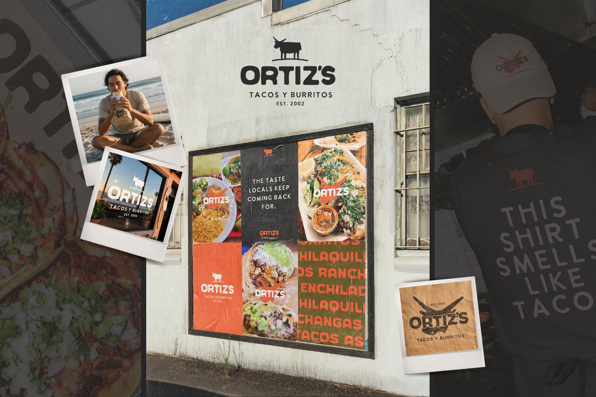
Ortiz’s Taco Shop is a family-owned Mexican restaurant in San Diego, beloved by surfers and local workers. Surrounded by expanding fast-food chains and post-COVID closures of independent restaurants, the business needed a cohesive identity that could compete visually with corporate brands while preserving its Latino heritage and neighborhood character.
Proposta
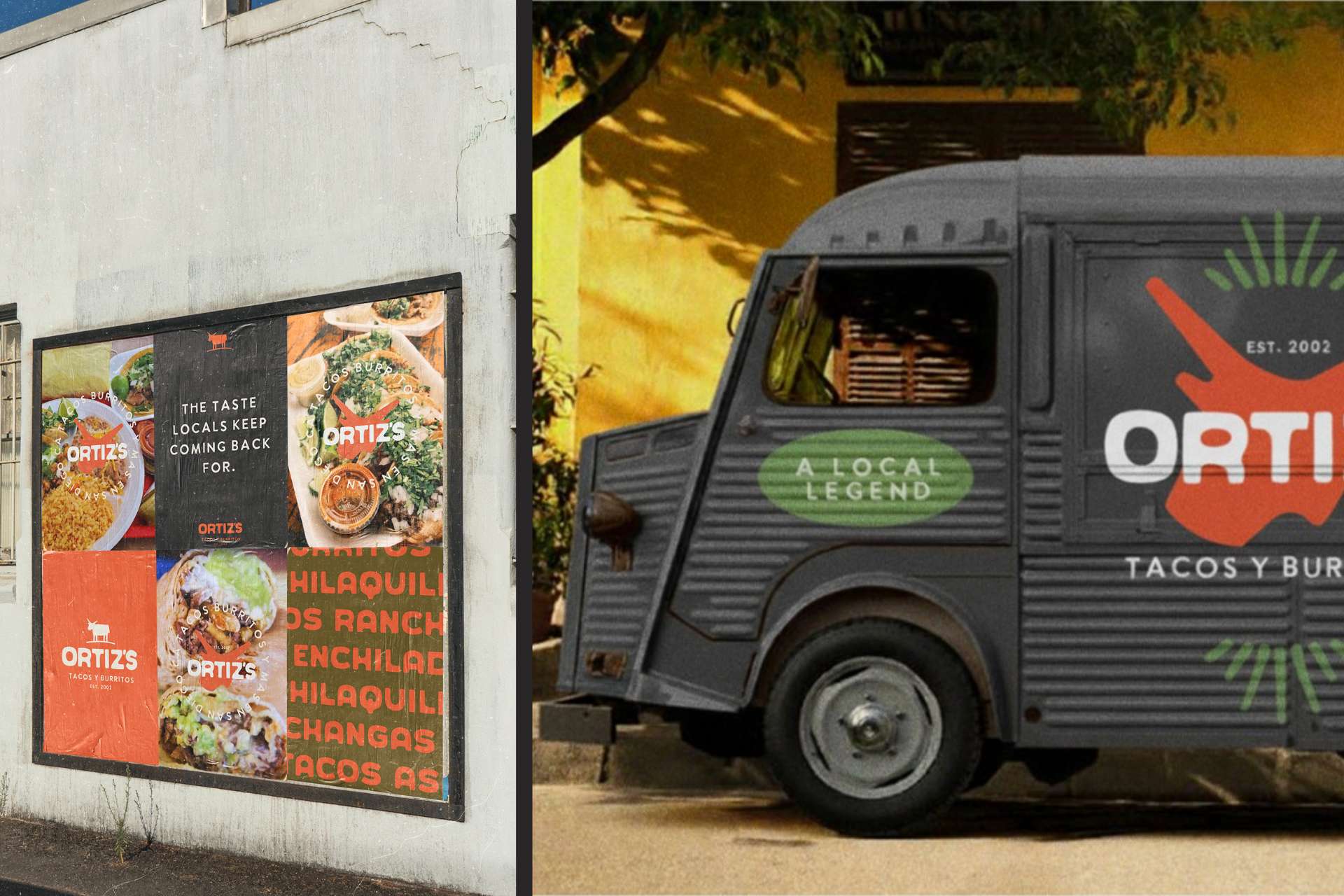
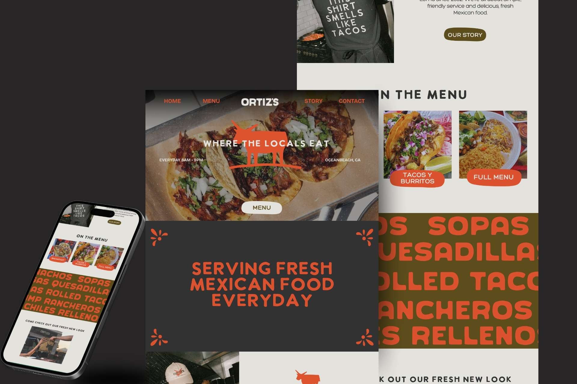
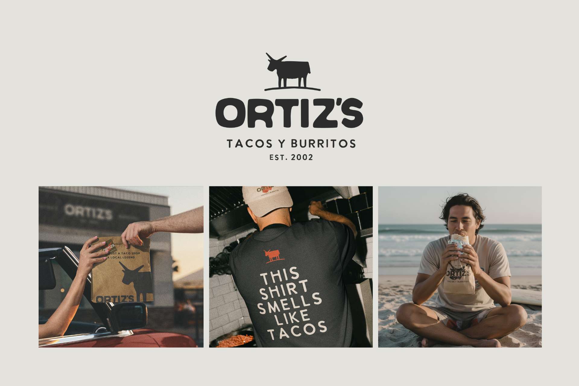
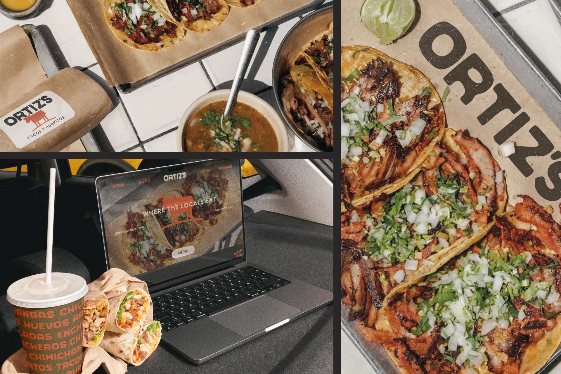
The project refined Ortiz’s existing identity into a unified, single-color brand system centered on a reworked bull icon and bold typography. Designed for legibility on inexpensive materials like brown paper bags and stamps, the system elevates everyday packaging while strengthening recognition. It positions the taquería as a resilient local legend rather than a scalable franchise model.
Aportació
A low-cost, culturally grounded identity system that strengthens independent visibility while reducing material and ink use.
Producció
The identity was engineered to function in one color, minimizing ink and fabrication complexity. It reproduces clearly across kraft paper packaging, window vinyl, apparel, and retail hot sauce labels without specialty finishes. By reducing material layers and print processes, the system lowers costs and environmental impact while ensuring consistent long-term application.